Wix Reviews Widget
The Reviews Widget is one of more than 60 site apps Wix offers businesses to place anywhere on their site and customize in both content and design. It lets stores collect and showcase product reviews and star ratings right on their product pages.
The Problem
Every online store needs social proof, yet Wix eComm stores had no built-in way to show reviews on product pages. Existing tools offered long, cluttered feeds and exhausting forms. Shoppers struggled to find answers, few customers left reviews, and stores lost trust and sales.
The Goal
A customizable reviews widget that turns customer feedback into a trusted decision-making tool. Reading reviews should be quick and focused, writing one should take seconds, and every store should adapt it to its brand without breaking the core experience.
Research
Key insights
92%
Of consumers hesitate to buy an item without reliable customer feedback
79%
Of customers trust online reviews as much as personal recommendations
91%
Of online shoppers read reviews always or regularly before buying
Primary Users
Key user groups
eComm Store Owners
Want an on-brand widget that builds real trust with shoppers.
Shoppers Reading Reviews
Want quick, trustworthy answers before they buy.
Shoppers Writing Reviews
Want to share their experience without a long form.
User Research
Why people read and write reviews
I started with two questions: what motivates people to read reviews, and what motivates them to write one?
| Reading reviews | Writing reviews |
|---|---|
| TrustReliable reviews show a company can be trusted. | SharingReleasing frustration or praising the brand. |
| Wisdom of crowdsLearning from other buyers' experience. | Self-expressionFeeling heard and empowered. |
| Easier decisionsLess effort choosing between options. | RecognitionBeing seen as someone with knowledge or taste. |
| Quality insightKnowing the best and worst that could happen. | CommunityGiving back to other shoppers. |
Pain points
The biggest
user pain points
Difficult feedback process
Long forms, minimum character counts and forced logins make people abandon the review flow.
Cognitive load
Too much unorganized information, no filters, and a "Write a Review" button that is hard to find.
Unreliable brands
Only positive reviews on top, or short reviews with no detail, make a store look less trustworthy.
Research takeaways
Trustworthy
Verified reviews, both positive and negative, build authenticity.
Customization
Businesses should organize reviews to fit their audience, such as grid or list layouts.
Smart features
Keyword filters based on the most common words make navigation quick.
Low cognitive load
Separate spaces for Reviews and Q&A keep the feed focused.
Clear information architecture
Few font sizes and colors, clear labels and grouping.
Trust is a design decision: every badge, filter and form field either builds confidence or adds friction.
Process
How I solved it
The solution turns reviews into a clear, trustworthy decision tool. Shoppers find the answers they need in seconds, and leaving a review takes only a few taps.
Built trust into every review
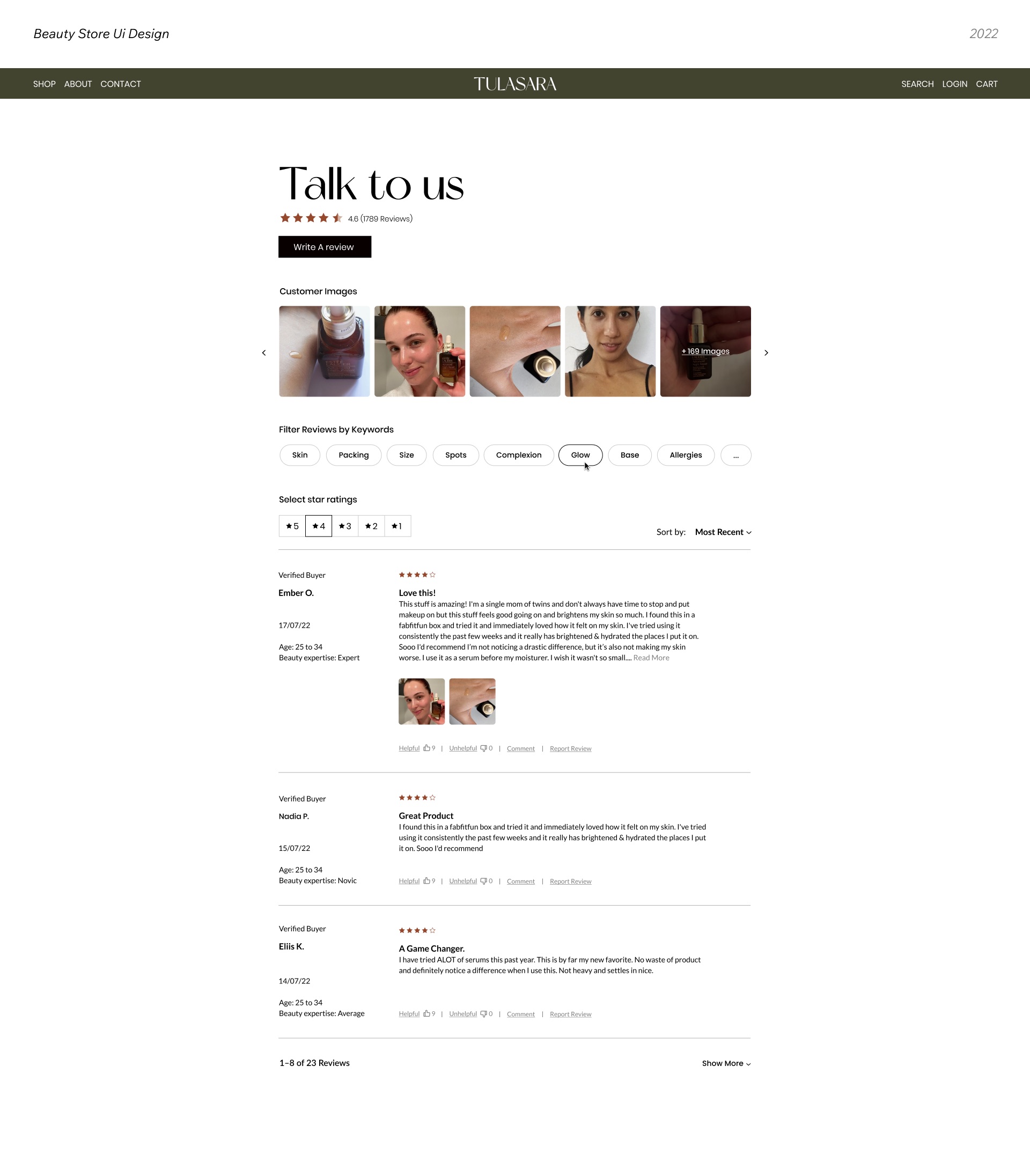
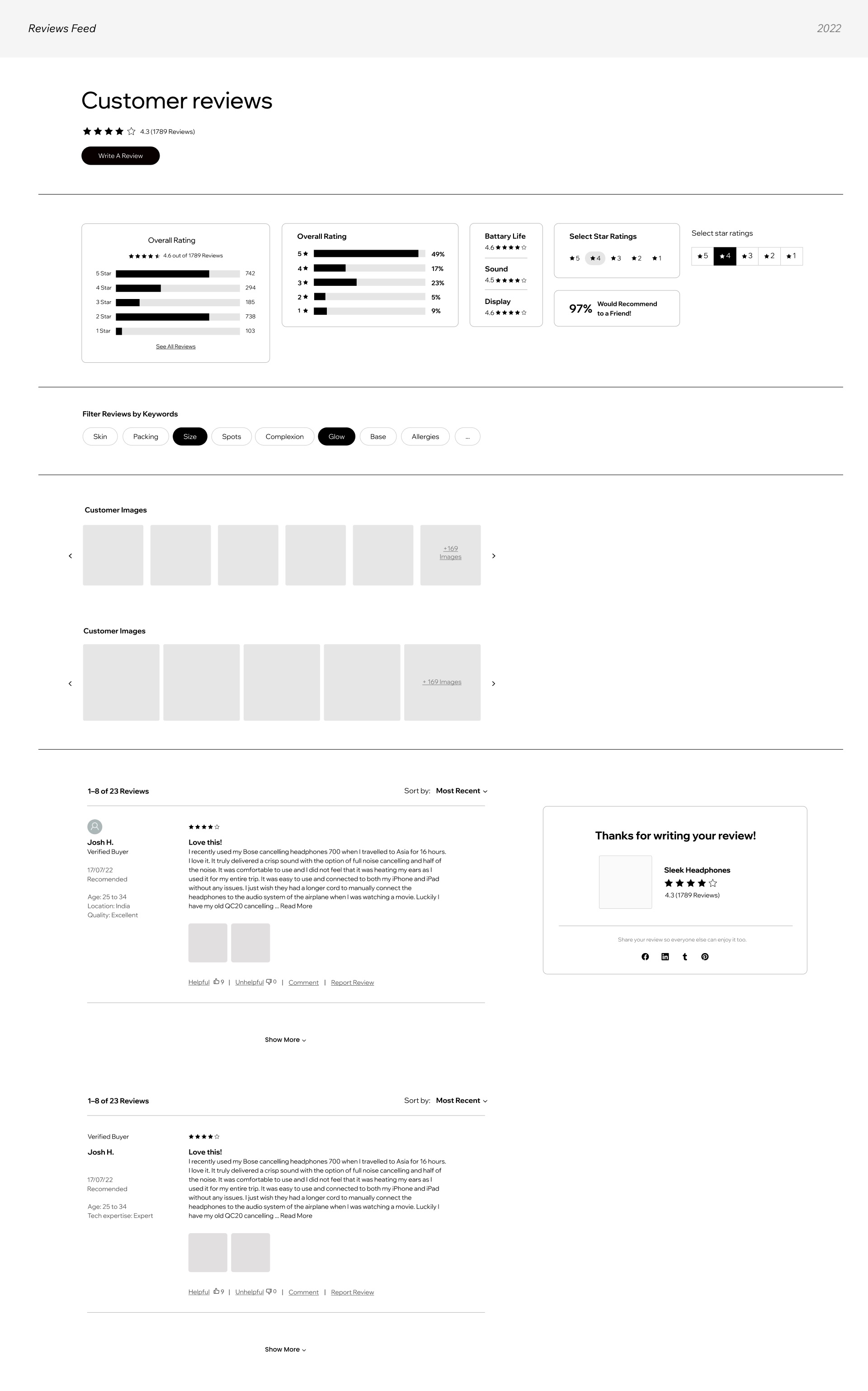
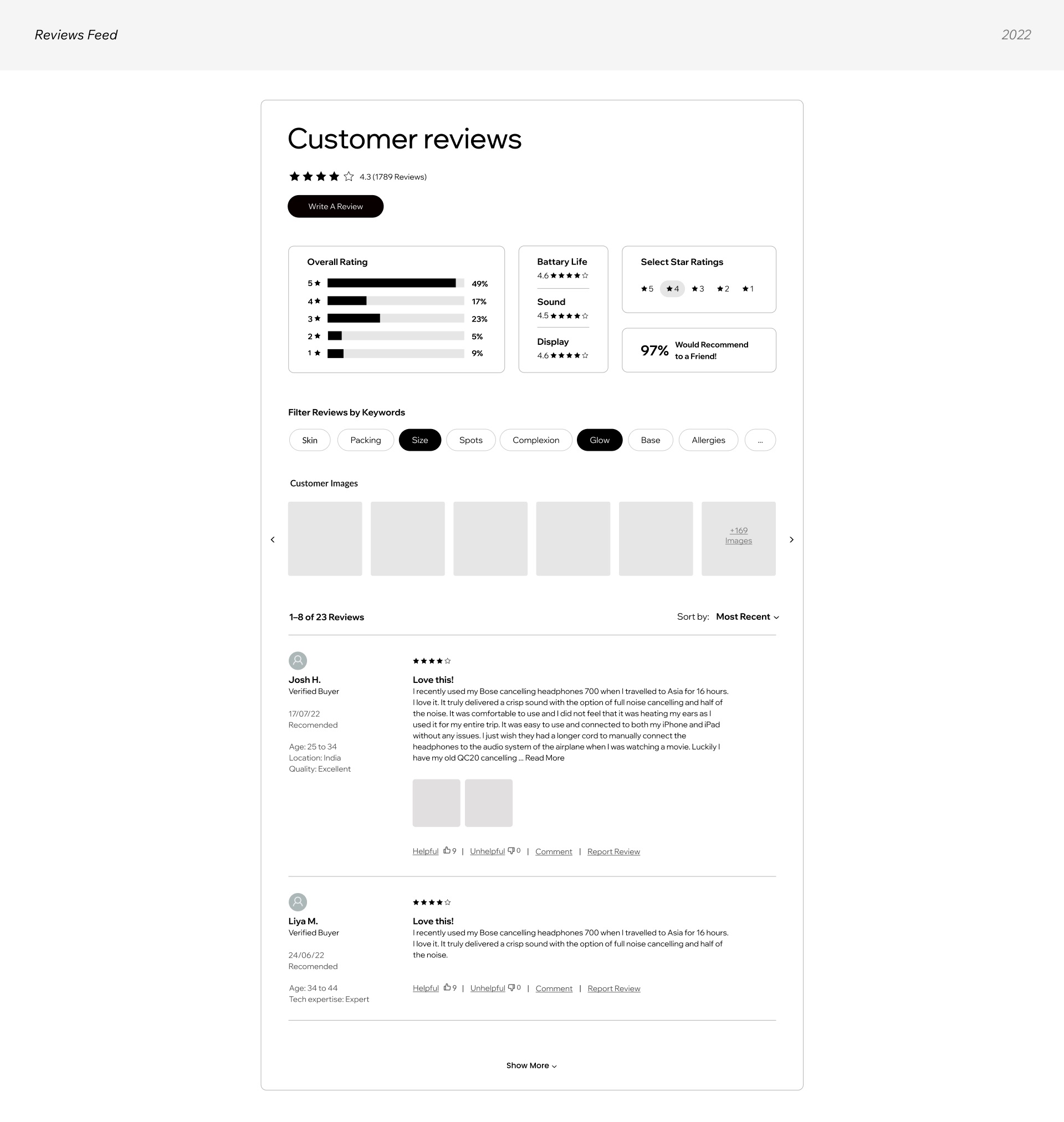
Verified-buyer badges, reviewer details like age and expertise, helpful and unhelpful votes, and a "would recommend" score, so shoppers can judge how credible each review is.
Organized the reviews feed
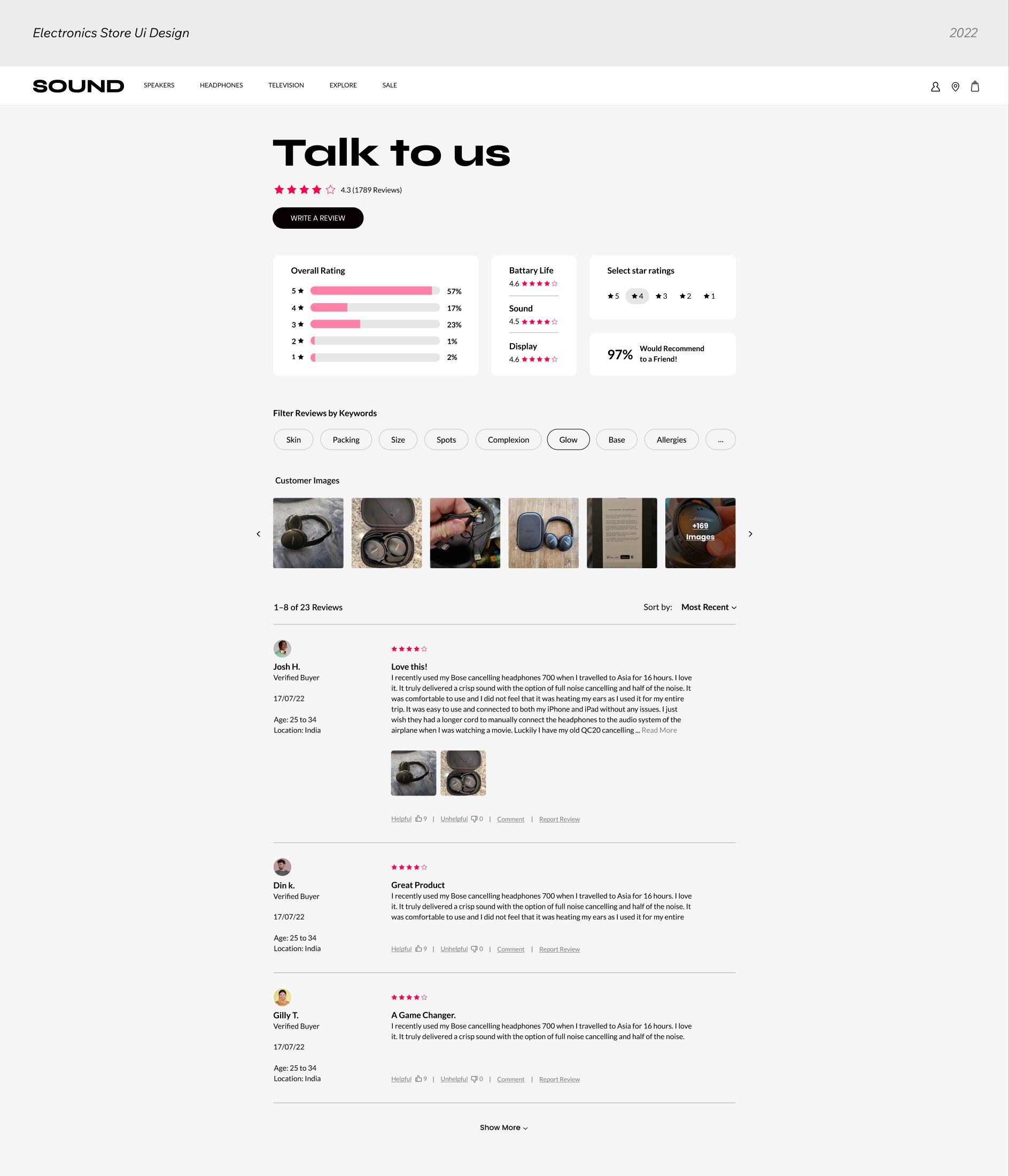
A rating summary with star distribution and sub-ratings, keyword filters, star filters, sorting and a customer photo gallery, so shoppers reach relevant reviews without a long scroll.
Simplified writing a review
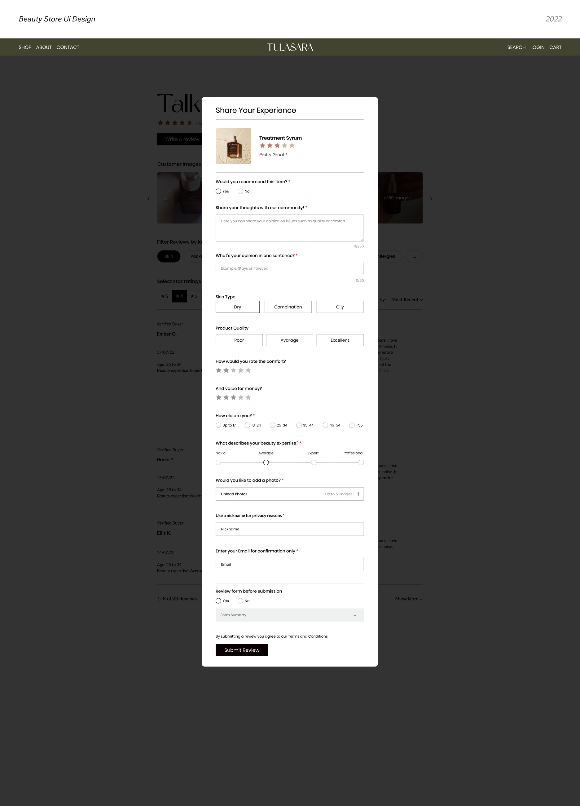
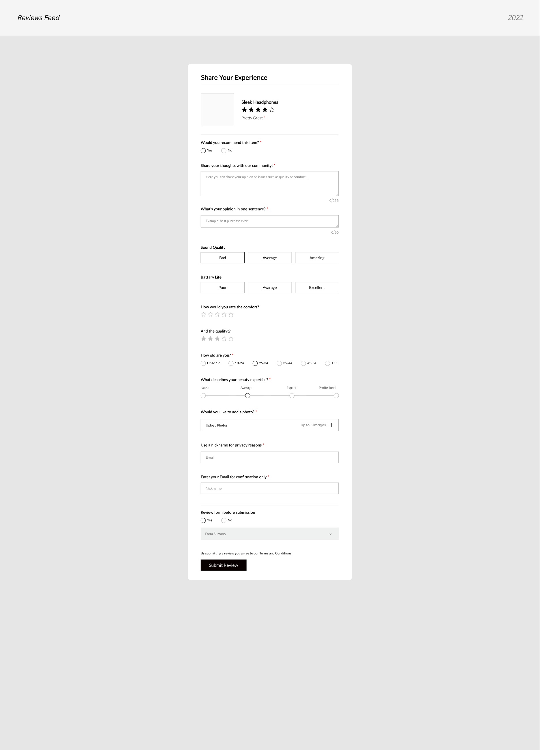
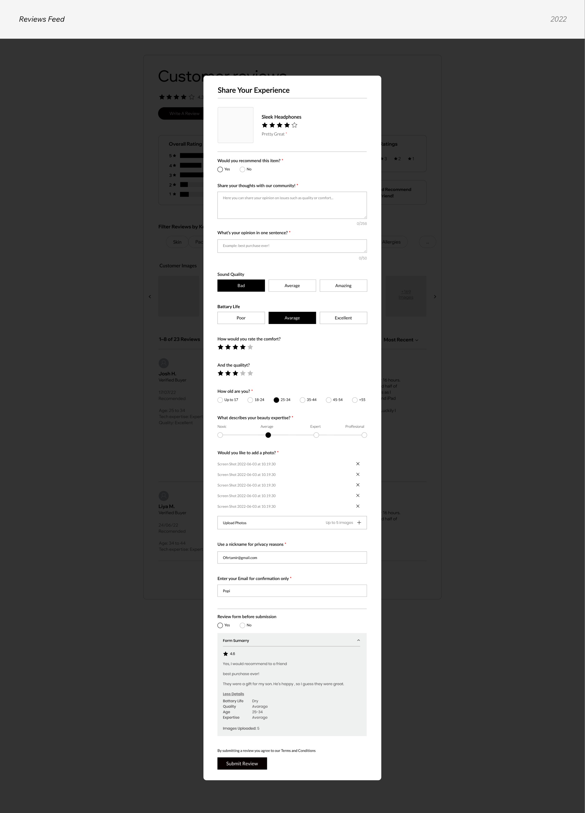
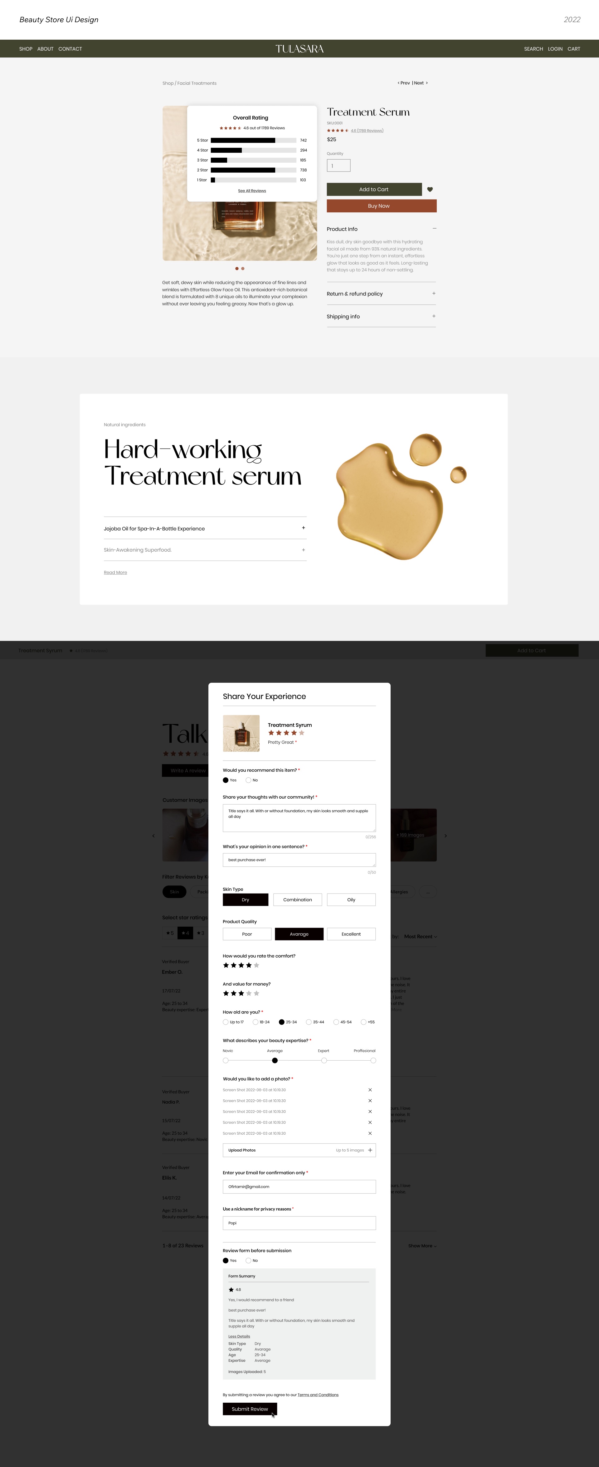
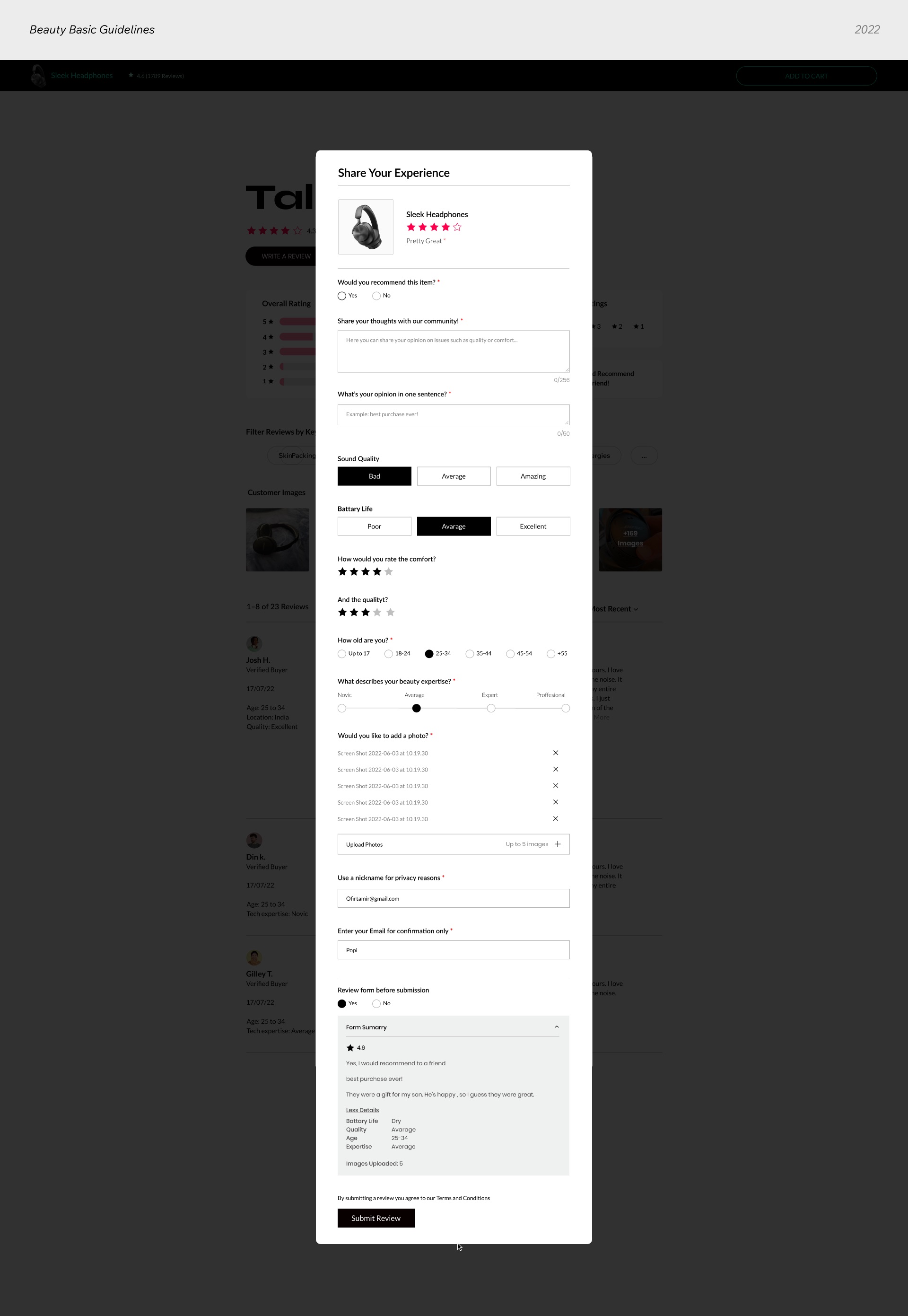
A short, guided form with labeled star ratings (2 stars = "So-So"), character counters, photo upload and a summary before submitting. No forced login.
Customizable for every business
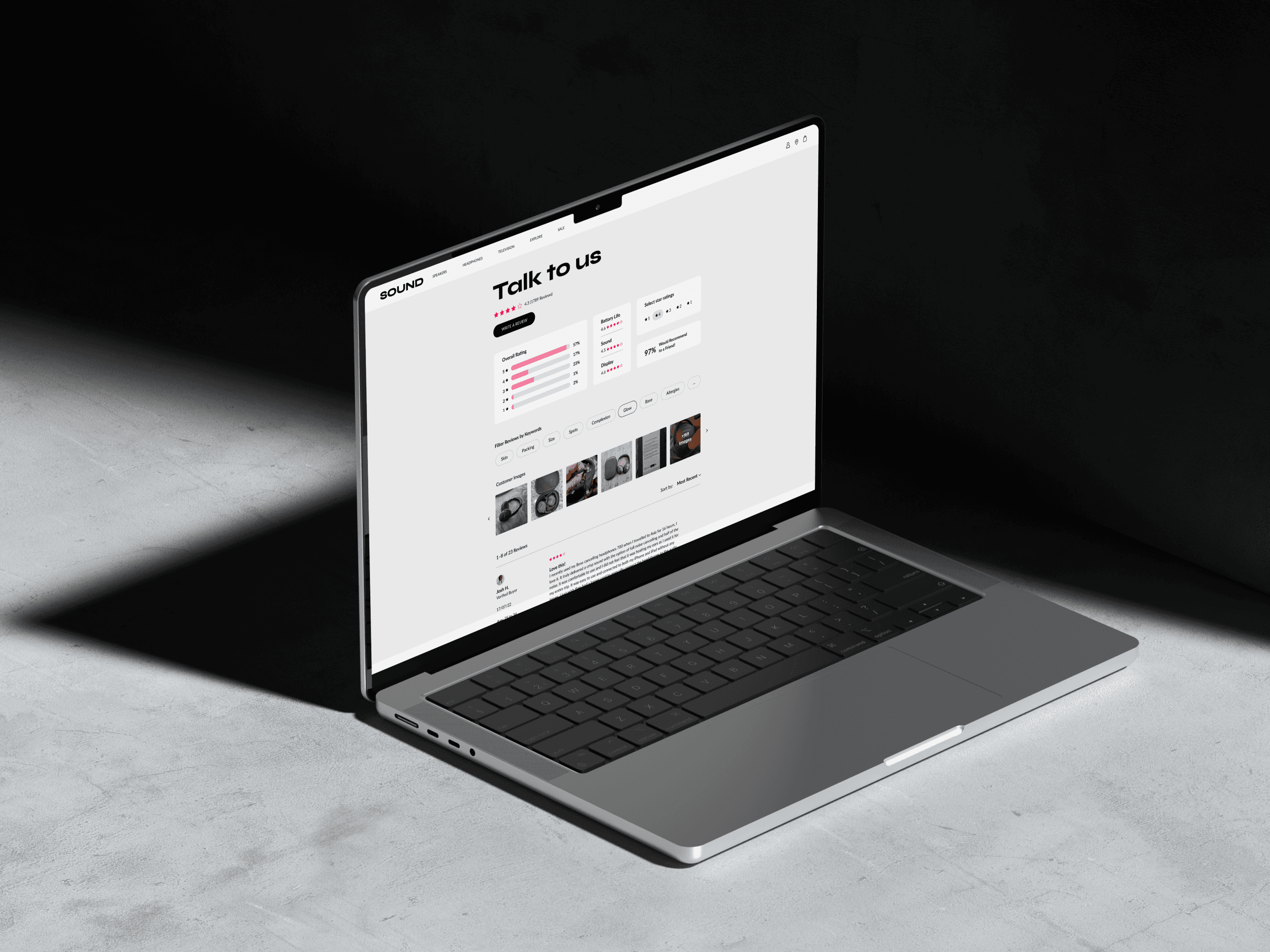
Each store adapts the widget to its category, with product-specific ratings and questions such as skin type for beauty or battery life and sound for electronics.
Process
Wireframes
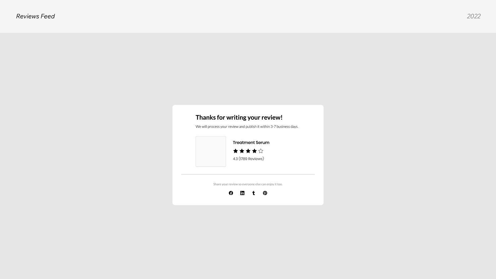
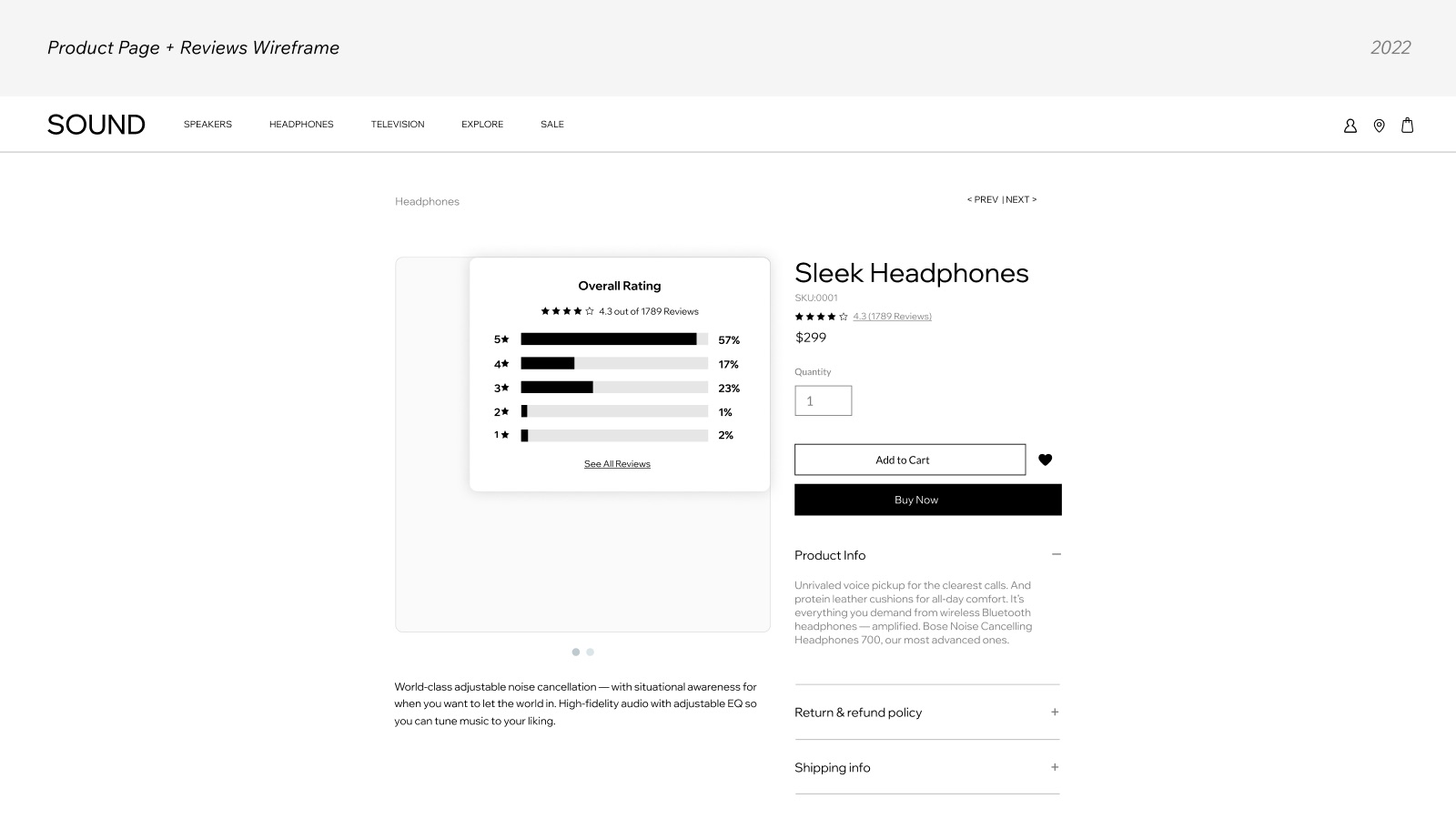
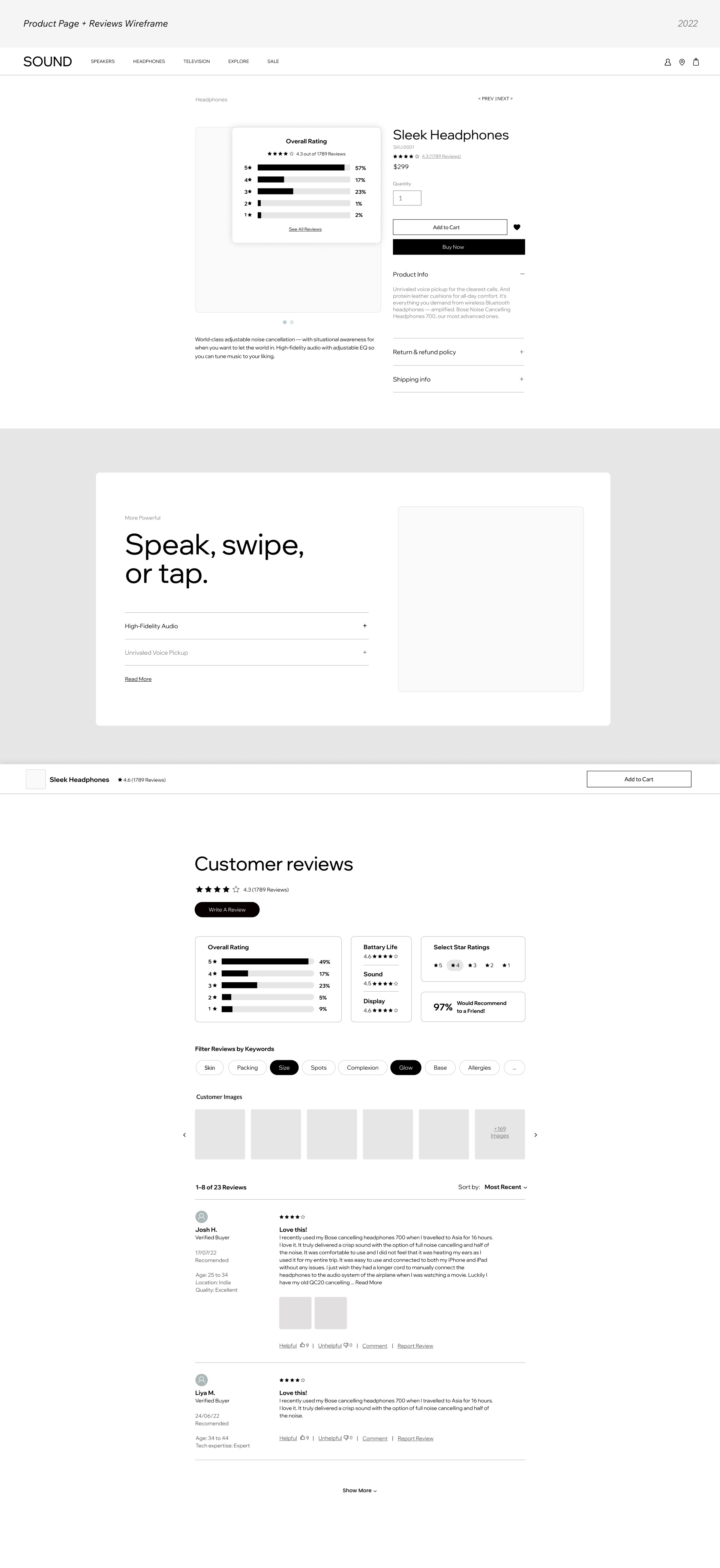
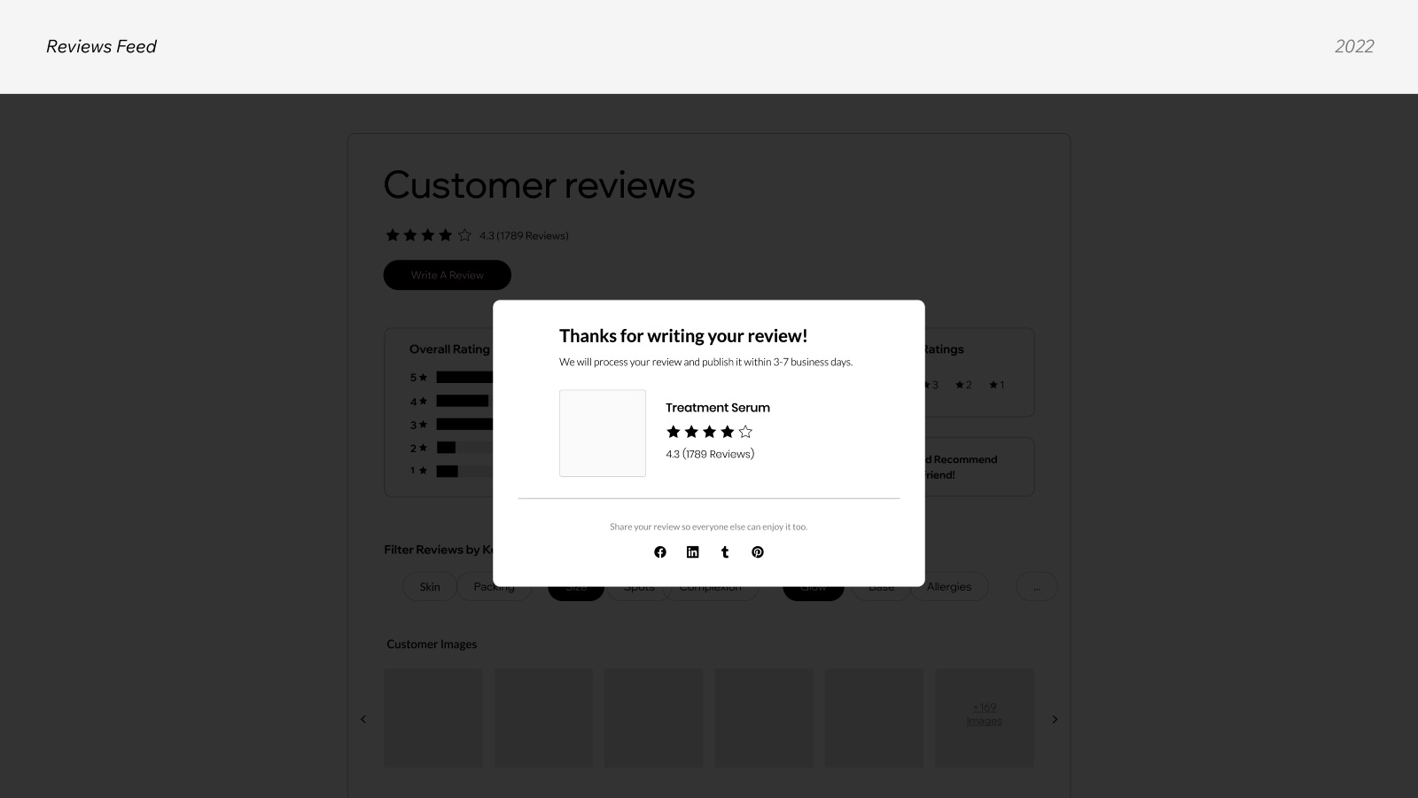
Before any visual design, I wireframed the full reviews experience inside a product page: the sticky star rating near the product title, the rating summary, the reviews feed, the write-a-review form in every state, and the confirmation screen. It let me test the structure and hierarchy once, then apply it to any brand.
Reviews widget / Product page & reviews wireframes
Two Stores, One Widget
Designed for two very different businesses.
To prove the widget adapts to any business, I designed it for two very different verticals. For each one I created a brand guide and a full eCommerce website, so the widget could be tested in a real brand context rather than a blank template.
| Store profile | Beauty Shop (Tulasara) | Electronics Store |
|---|---|---|
| Audience | Gen Z women, ages 18–24 | Millennials, ages 25–34 |
| What they look for | "Clean" ingredients, skincare | Best quality for their budget |
| Main need in reviews | Easy answers on specific topics | Simple product comparison |
| Custom review fields | Skin type, beauty expertise, product quality | Battery life, sound, tech expertise |
Two brand guides
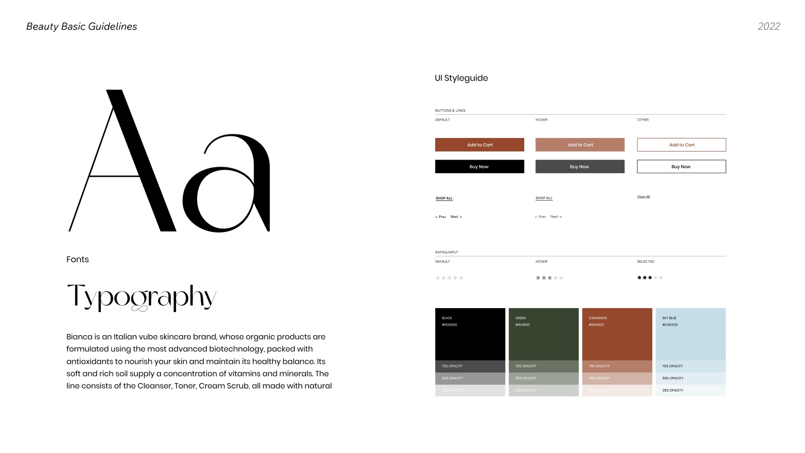
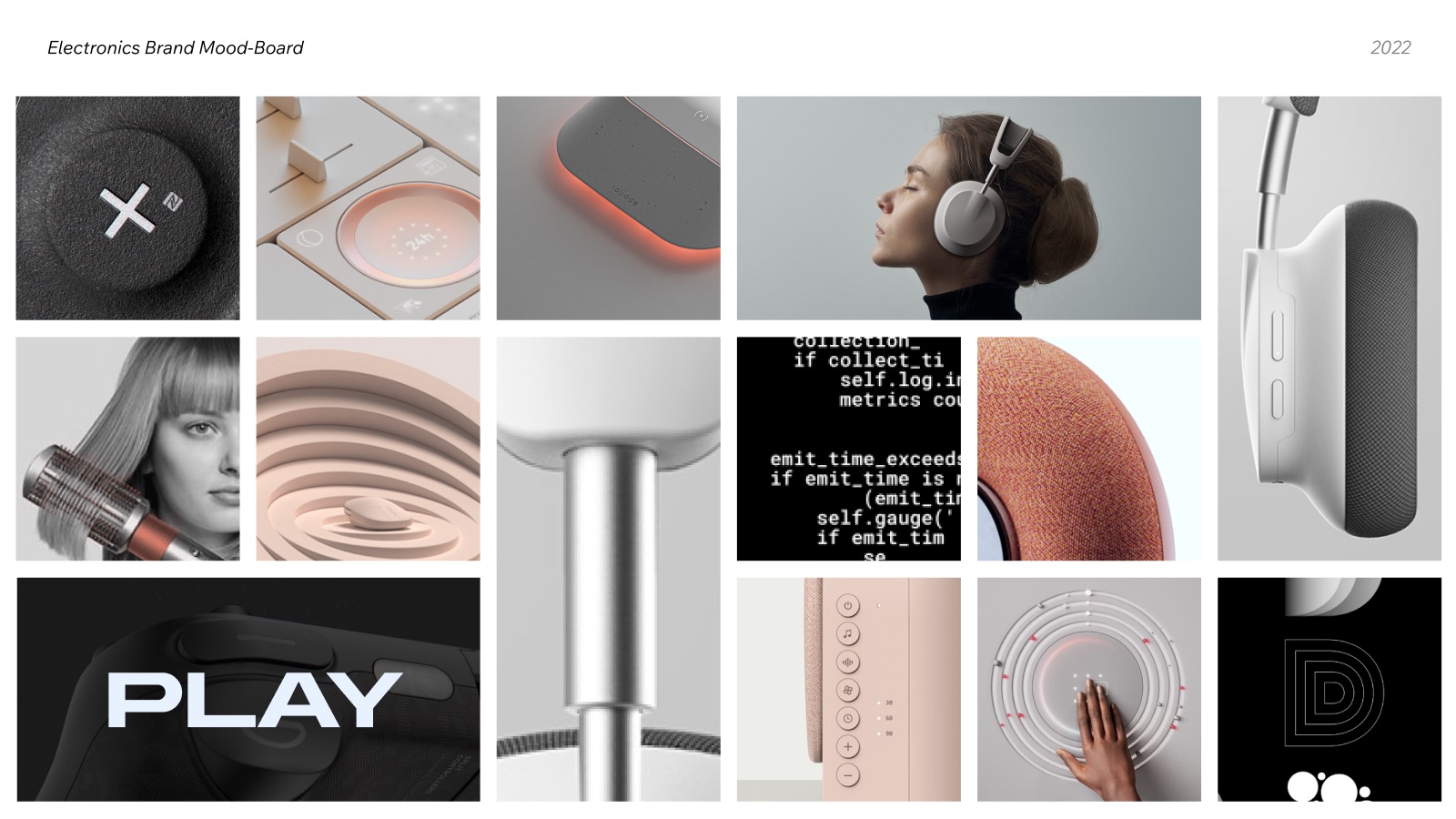
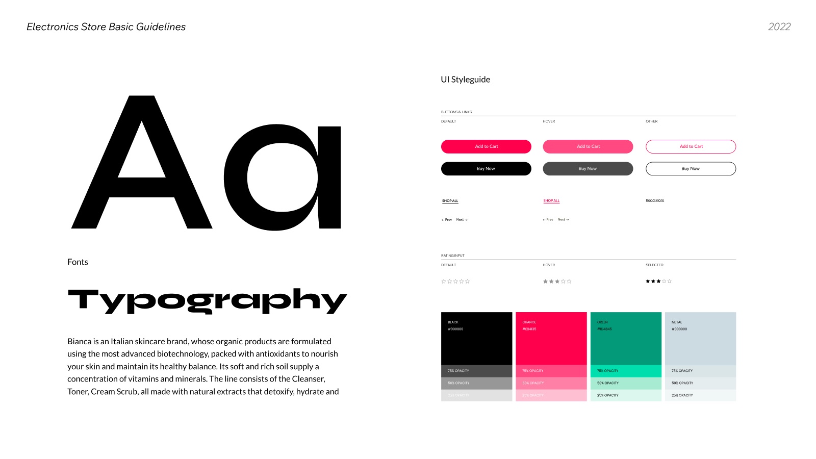
Each store got its own brand guide: a mood board, typography, a color palette and a UI style guide for buttons, links and the rating input in every state. The guides gave the widget a real visual language to adapt to, and showed how the same components change with brand styling alone.
| Brand guide | Tulasara (Beauty) | Electronics Store |
|---|---|---|
| Mood | Natural, soft, organic skincare | Bold, technical, high-contrast |
| Colors | BlackGreen #1D4B45Cinnamon #95482CSky Blue #C6DEE8 |
Black (Metal)Orange #E84135 |
| UI style guide | Buttons & links, rating input states, navigation | Buttons & links, rating input states, navigation |

Two eCommerce websites
I designed a complete website for each brand: a product page with the reviews widget built in, from the sticky star rating at the top down to the reviews feed and the write-a-review flow. Tulasara sells facial oils and serums. The electronics store sells headphones and speakers, its customers' top category.
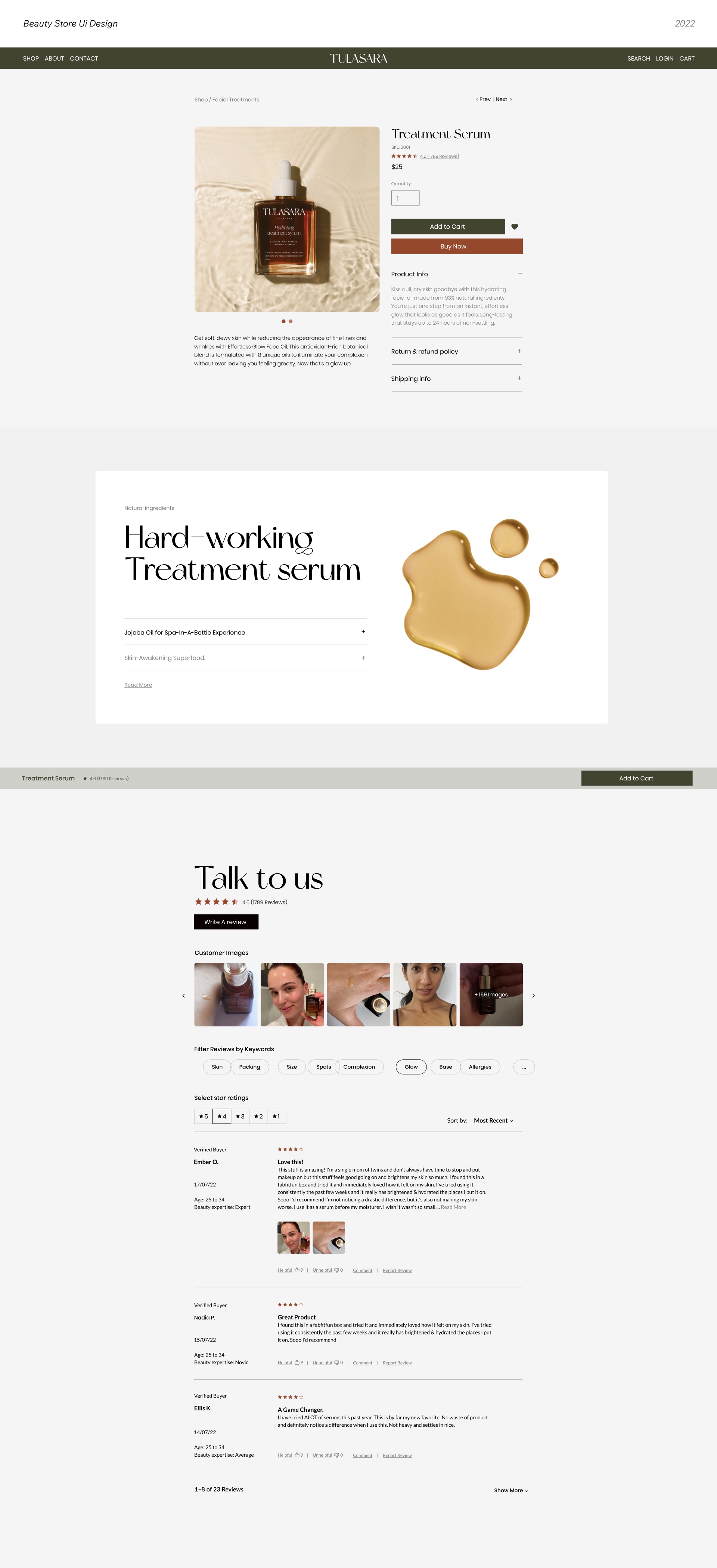
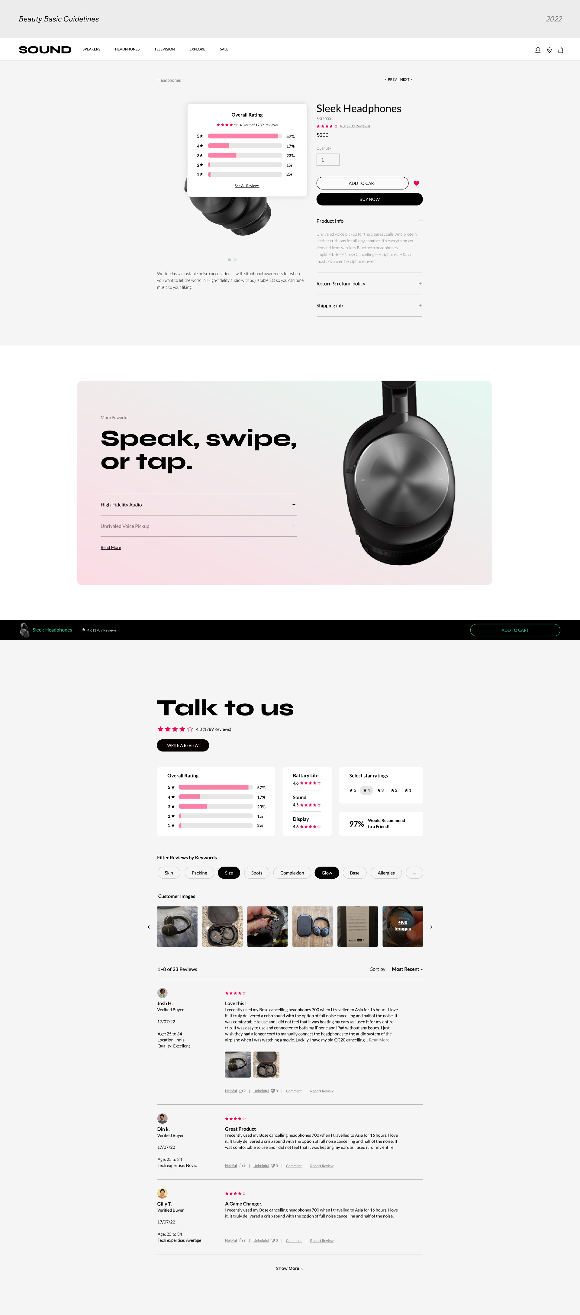
Scroll inside each page to see the full design.
Final Design Solution
Same structure, a different look.
The final designs bring the widget to life on both stores. Shoppers see the rating as soon as they land on the product. They can filter the feed down to what matters to them, and they can leave a review in one short, guided flow. Both stores run on the same themeable component system: the widget inherits each site's typography, colors and spacing, while the components and interactions stay the same.
Going Forward
What's next
The research surfaced more ideas than one version could hold. The next step would add:
Reviews tagging
Group reviews into the most popular themes, so shoppers jump to what matters.
Q&A section
A dedicated place to ask direct questions and learn from the answers.
Dedicated reviews page
Showcase every review in one place, boosting social proof and SEO.
Horizontal layout
Keep the star rating sticky on the side to avoid long scrolling.
Reflection
What I learned
This project taught me that a widget is only as good as its flexibility. Designing one system for two very different businesses pushed me to separate structure from style, so the same experience could feel native to a skincare brand and to an electronics store. It also showed me that trust is a design decision: every badge, filter and form field either builds confidence or adds friction.